4 UX Secrets I Learned From a Single ERP Screen

Introduction: The Search for Simplicity
If you work with modern business software, you know the frustration. Interfaces are often a maze of complex menus and sub-menus. Accomplishing a simple task can feel like a scavenger hunt, forcing you to jump between different screens, tabs, and windows, breaking your concentration and wasting valuable time. We've come to accept this complexity as a necessary evil for powerful software, but does it have to be this way?
I recently discovered a surprisingly powerful design in an unexpected place: a client list screen within an ERP system called PROTO Flow. At first glance, it looks like any other customer database. But upon closer inspection, it reveals itself to be a masterclass in efficiency, workflow integration, and user-centric design. This single screen offers a blueprint for how to build software that is both immensely powerful and intuitively simple. This post will break down the four most impactful takeaways from this design.
1. It's Not a List; It's a Command Center
On the surface, the screen presents a standard, filterable list of customers and prospects. You can see basic information and even filter the list by activity type, such as CHIMIE (Chemicals) or CONSTRUCTION. This is standard functionality.
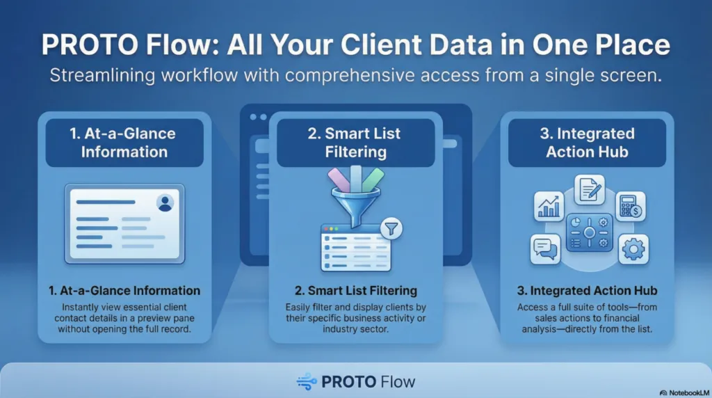
The screen's true power, however, is revealed in the contextual side menu. This menu transforms the simple list from a passive data viewer into an active command center. It does this by creating a strong information scent—the user can clearly see what actions are possible—and providing clear affordances for those actions. Instead of just looking at a client, a user can immediately act. The "Actions commerciales" (Commercial Actions) menu provides direct access to a vast range of client-related activities, including scheduling appointments (Prise de Rendez-vous), preparing tasks (Préparation d'une tâche), and initiating direct communication via Téléphone, Émail, or SMS. This reduces the user's mental effort in figuring out "what can I do next?" The core benefit of this centralized design is profound.
Through this list of clients/prospects, a huge amount of information is accessible without having to get lost in a multitude of menus and sub-menus in PROTO Flow.
2. Instant Insight, Zero Clicks Deep
One of the biggest productivity killers in enterprise software is context switching—the act of navigating away from your current task to find a piece of information. The PROTO Flow screen solves this brilliantly. When a user selects a company from the list, an information panel activates at the bottom of the screen.
As the source documentation notes, this design ensures a user can "quickly see essential information at the bottom of the screen...without having to display the client/prospect file." This drastically reduces cognitive load. For the selected company, you can instantly see the primary contact (M. ALBETSON), key phone numbers, email address, and company URL. Additional information is neatly organized into tabs like Actions, Contacts, and Documents associés (Associated Documents). This is a powerful UX feature because it prevents workflow fragmentation and respects the user's state of flow. By providing critical data exactly when and where it's needed, it minimizes disruption and allows the user to stay focused on the task at hand.
3. Your Customer List is Also Your Business Intelligence Dashboard
In many organizations, customer relationship data lives in one system, and financial data lives in another. Bridging that gap to get a complete picture of a customer relationship often requires running separate reports and manually connecting the dots.
The PROTO Flow design demolishes these silos with its "Analyses" section in the side menu. This is a masterclass in data integration at the point of action. With a single client or group of clients selected, a user can instantly pull up related Devis commerciaux (Sales quotes), Factures (Invoices), analyze Chiffre d'affaires (Revenue), or jump directly to a comprehensive Tableau de bord (Dashboard). The genius isn't just that the data is available, but that it's available from the customer list itself. This turns a simple operational tool into a strategic one, preventing the common problem where valuable business intelligence tools are isolated from the daily operational interface.
4. Real-World Tools Are Seamlessly Integrated
Effective business operations don't happen in a vacuum; they interact with the physical world. This interface shows a keen understanding of this reality by seamlessly integrating practical, real-world utilities directly into the workflow.
This principle is evident across multiple menus, which bring disparate real-world tasks into a unified workflow. The "Outils Internet" (Internet Tools) menu lets a user map a Localisation (Location) or generate an Itinéraire routier (Driving directions) before a client visit. Meanwhile, the "Actions commerciales" (Commercial Actions) menu integrates physical office tasks like Scanner un document (Scan a document) directly alongside digital communication tools. Finally, the "Utilitaires divers" (Miscellaneous Utilities) menu provides functions for Gestion de contrats (Contract management) or generating a QR Code. By building these external tools into the core interface, the ERP becomes a far more comprehensive and practical assistant for the user's entire job, not just their on-screen tasks.
Conclusion: The Power of Thoughtful Design
The lesson from the PROTO Flow interface is clear: immense functionality and user power do not have to come at the cost of simplicity. By centralizing actions, providing contextual information, and integrating workflows, thoughtful design can transform a mundane screen into an incredibly efficient operational hub. It proves that the goal isn't just to add more features, but to make existing features more accessible and intuitive.
It makes you wonder: how much hidden potential is sitting in the software we use every day, and what could we achieve if it were all this easy to access?